Track Incident Value
- Click any chart segment, severity bar, or root-cause tile to drill down into matching incidents with search and filtering
- Filter the entire dashboard to a single response plan — all KPI cards, charts, and treemap update
- Four KPI cards show hours saved, success rate with stacked outcome bar, median time-to-mitigate, and quality score with star ratings (1–5)
- Treemap root-cause view sizes tiles proportionally by incident count so your biggest problem is immediately visible
The problem: you can't prove your agent is working
You deployed an AI agent to handle incidents. Leadership wants to know: Is it actually reducing toil? Which incidents is it resolving on its own? Are we getting ROI from this investment?
Today, answering those questions means manually querying telemetry, cross-referencing incident tickets, and guessing which response plans are effective. There's no single view that shows what your agent did, how well each response plan performed, or whether mitigation rates are improving over time.
Without this data, you can't distinguish a response plan that resolves 80% of incidents autonomously from one that escalates everything to humans. You can't show your team that the agent handled 15 incidents overnight while everyone slept. And you can't make informed decisions about where to invest in better automation.
How incident value tracking works
Your agent records an activity snapshot every time it processes an incident. These snapshots capture the outcome — whether the agent mitigated the incident autonomously, assisted the investigation, or escalated to a human. The incident metrics dashboard aggregates these snapshots into four interactive KPI cards, a volume chart, a root-cause treemap, a severity distribution chart, and a per-response-plan performance grid.
Navigate to Operations Hub → Incident Analytics to see the dashboard. You can also access the full incident analytics from the Operations Hub sidebar item.
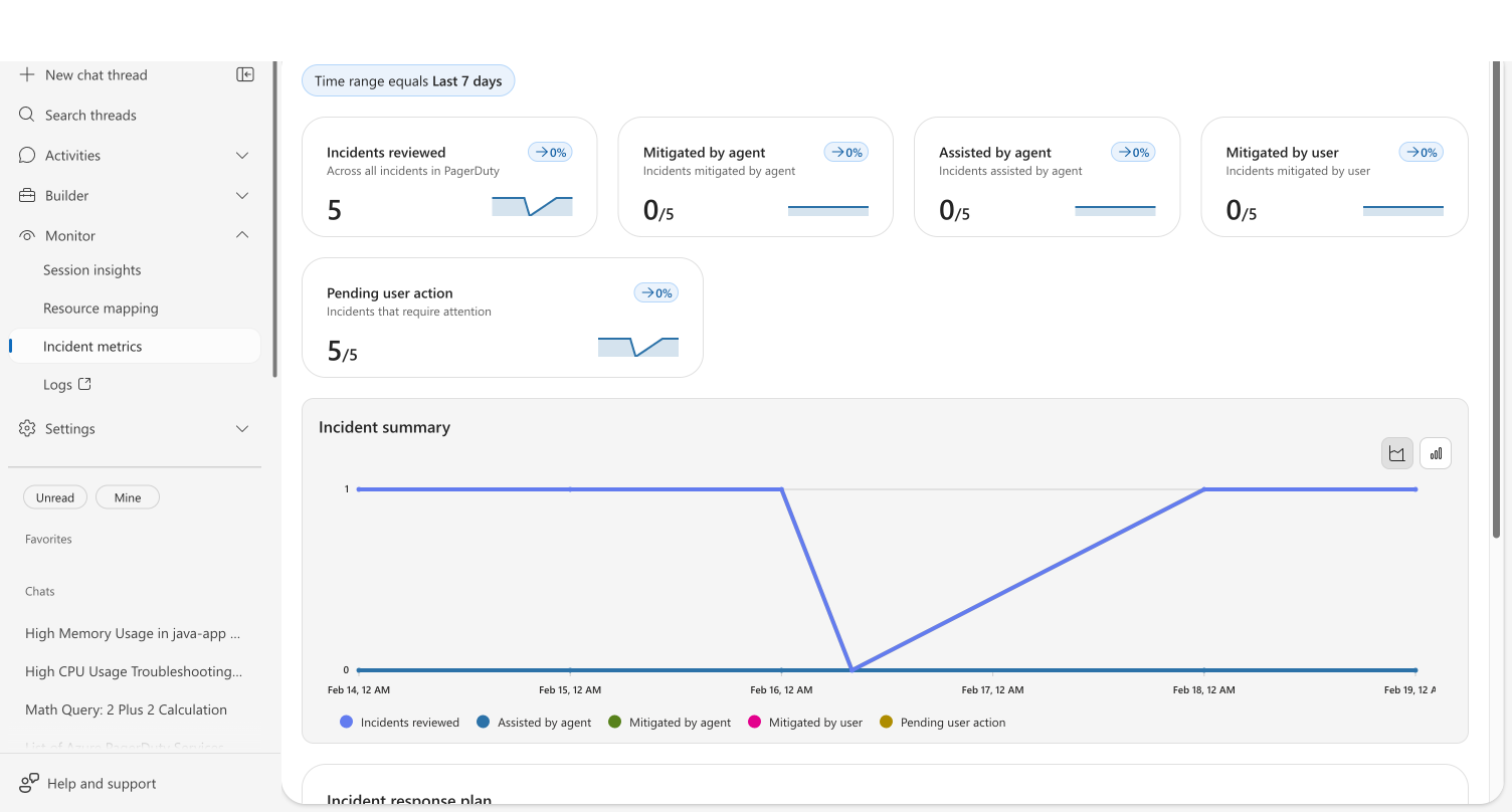
KPI cards
Four cards at the top give you an at-a-glance summary. Each card is clickable — open it for a detailed trend chart:
| Card | What it shows |
|---|---|
| Estimated engineering time saved | Total hours your agent saved, with ↑/↓ trend vs. previous period |
| Agent-supported resolution rate | Percentage of incidents resolved or assisted, with a stacked outcome bar showing agent mitigated, agent assisted, human mitigated, and active/pending segments |
| Median Time to Mitigate | Proportional comparison bars showing agent P50 resolution time vs. human P50, with a percentage badge when the agent is faster |
| IntentMet evaluation score | Intent Met evaluation score (X / 5) with a star rating — full, half, or empty stars based on score |
The Success Rate card includes a stacked outcome bar — a thin horizontal bar with four color-coded segments that shows the distribution of incident outcomes at a glance. Below the bar, a 2×2 grid displays the count for each category.
The Quality Score card uses a 5-star rating to make the Intent Met score instantly readable. Stars are full (score ≥ 0.75 at that position), half (≥ 0.25), or empty. The same star rating appears in the response plan grid's Quality column.
Interactive drill-down
Every visualization in the dashboard is clickable. Click a segment to open a drill-down modal showing the matching incidents:
| Click target | What the modal shows |
|---|---|
| Root-cause treemap tile | Incidents with that root cause |
| Severity distribution bar | Incidents at that severity level |
| Volume chart data point | Incidents from that date, optionally filtered by outcome |
| Volume chart legend label | All incidents with that outcome type |
The drill-down modal displays up to 200 incidents with sortable columns: ID, Title, Severity, Status, Created, Assisted By Agent, and Mitigated By. Use the search box to filter by incident title, ID, severity, or status.
Click an incident title to open the investigation thread in a side drawer — you can review exactly what the agent did without leaving the analytics page.
Root-cause treemap
Root causes appear as proportionally sized tiles — larger tiles mean more incidents with that root cause. Tiles are color-coded from a palette of 10 colors (cornflower, teal, orchid, green, orange, and more) assigned by sort order to make each root cause visually distinct.
Each tile displays the root cause name and incident count. Hover for a tooltip with the exact count. Click any tile to drill down into incidents with that root cause.
Incident volume chart
A stacked chart shows incident volume over time, broken down by outcome: agent mitigated, agent assisted, human mitigated, and active/pending. Toggle between area and bar chart views using the buttons at the top right of the chart.
Click any data point to drill into that day's incidents. Click a legend label to see all incidents of that outcome type across the time range.
Severity distribution chart
A horizontal stacked bar chart breaks down incidents by severity level. Each bar shows the outcome proportions — how many incidents at each severity were mitigated by the agent, assisted, resolved by a human, or are still active. Click a bar to drill down into incidents at that severity.
Background caching
The incident metrics dashboard runs its data queries in parallel and caches results in memory for the current time range and selected response plan. Navigating away and returning shows your data instantly without triggering new queries. Only changing the time range, selecting a different response plan, or clicking refresh triggers a fresh data load. When new data does load, previous in-flight queries are automatically cancelled before the new batch starts.
Response plan performance
Below the charts, a Response Plan Performance grid shows per-plan metrics with seven sortable columns:
| Column | Description |
|---|---|
| Response Plan Name | Click to filter the entire dashboard to this plan |
| Mode | Autonomy level badge (Autonomous, Copilot, etc.) |
| Incidents | Distinct incident count |
| Agent Mitigated | Count of autonomous resolutions |
| Success Rate | Percentage with color coding — green (≥ 70%), yellow (≥ 40%), red (< 40%) |
| Avg TTM | Average time to mitigate |
| Quality | Star rating plus numeric Intent Met score |
Click any row to filter the entire dashboard — all KPI cards, charts, and the treemap update to show data for only that response plan. A back arrow appears at the top; click it to return to the overview.
Use the search box above the grid to filter plans by name.
This is where the real decisions happen. You can see at a glance which plans run in Autonomous mode and resolve incidents without human involvement versus plans in Review mode that still require approval. If a plan consistently shows a low success rate, it's a signal to adjust the response plan's instructions or increase its autonomy level.
Intent Met score
The Intent Met score measures how effectively your agent resolves work — whether that's an incident investigation or a scheduled task execution. After each thread completes, an automated evaluation scores the outcome on a 1–5 scale:
| Score | Meaning |
|---|---|
| 5 | Exceptionally resolved — exceeded expectations with additional insights |
| 4 | Well resolved — successfully completed with clear evidence of satisfaction |
| 3 | Partially resolved — made progress but didn't fully resolve, or thread is waiting for user action |
| 2 | Poorly resolved — attempted but failed significantly |
| 1 | Completely unresolved — failed to address the core objective |
The Quality Score KPI card on the dashboard displays the average Intent Met score as X / 5 with a star rating visualization. The same star rating appears in the response plan grid's Quality column, making it easy to compare quality across plans at a glance.
The score combines results from both incident threads and scheduled task threads into a single unified metric. Your agent's effectiveness at proactive automation — scheduled health checks, compliance scans, cost monitoring — is measured alongside reactive incident response, giving you one number that captures overall agent quality.
Intent Met scoring is fully automatic. No configuration is needed — every completed incident and scheduled task thread is evaluated using the same scoring criteria. Scheduled tasks that are still waiting for user action receive a score of 3, reflecting their indeterminate outcome.
If your Intent Met score is lower than expected, review individual thread conversations in Monitor → Session insights to understand where the agent struggled. Common improvements include clearer task instructions, adding relevant connectors, or adjusting the agent's tools.
Before and after
| Before | After | |
|---|---|---|
| Proving agent value | Query telemetry, cross-reference tickets, write manual reports | Open one dashboard — mitigation rate, trend, and per-plan breakdown visible instantly |
| Knowing which plans work | Guess based on anecdotal feedback | Per-plan grid shows exact mitigation counts, success rate, TTM, and quality stars |
| Investigating specific incidents | Cross-reference the incidents list page with dashboard metrics manually | Click any chart segment to drill down into matching incidents with search and filtering |
| Filtering by response plan | Mentally track which plan's data you're looking at across separate views | Click a plan row — the entire dashboard (KPI cards, charts, treemap) filters to that plan |
| Understanding root causes | Flat lists or donut charts that don't convey proportional impact | Treemap tiles sized by incident count — the biggest tile is your biggest problem |
| Assessing quality per plan | Open individual investigation threads and manually judge resolution quality | Star ratings in the grid show Intent Met scores per plan at a glance |
| Stakeholder updates | Compile weekly summaries by hand | Daily reports generated automatically with incident counts, health status, and recommended actions |
| Dashboard loading | All cards and charts blank until every query finishes | Each card and chart renders independently as its data arrives — start reading metrics in seconds |
Incident overview
For a real-time view of every incident your agent is handling, go to Incidents in the left sidebar.

The page shows summary cards for incident status (Triggered, Acknowledged) and agent investigation status (Pending user input, In progress, Completed), plus a filterable grid of all incidents. Select Add filter to add filters by time range, priority, status, or investigation status, or use the search box to find specific incidents. When two or more filters are active, select Clear all to reset them at once.
Each row links to the agent's investigation thread, so you can review exactly what the agent did — which tools it called, what evidence it found, and what it recommended.
Daily reports
Your agent generates automated daily reports accessible at Daily reports in the left sidebar.
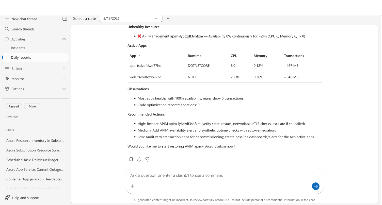
Select a date to view that day's report. Each report covers:
- Security findings — CVE vulnerabilities across connected repositories, grouped by severity
- Incidents — Active, mitigated, and resolved counts with per-incident investigation details
- Health and performance — Per-resource health status with availability, CPU, and memory metrics
- Code optimizations — Performance recommendations identified by the agent
- Recommended actions — Prioritized action items with descriptions and estimated effort
Daily reports replace the "what happened overnight?" morning routine. Instead of asking your agent or querying dashboards, the information is already compiled and waiting.
What makes this different
Incident metrics dashboards aren't new — most observability platforms have them. What's different here is that you're measuring the agent's contribution, not just incident volume — and every metric is interactive.
The interactive drill-down closes the loop between aggregate metrics and individual incidents. When you see an 80% success rate, you can immediately click to see which 20% failed, what root causes drove them, and what the agent attempted.
The per-response-plan filtering answers a question no general-purpose dashboard can: "Which of my AI automation strategies are actually working?" Click a plan row and the entire dashboard filters to that plan — KPI cards, volume chart, treemap, and severity chart all update.
The treemap root-cause view makes proportional impact immediately visible. Instead of reading a flat list where categories look equally important, the treemap's tile sizes show you at a glance which root cause accounts for the majority of incidents.
The Intent Met score adds a quality dimension with visual star ratings. Instead of just counting incidents resolved, it evaluates how well each thread was resolved. A plan with high volume but low stars needs different attention than a plan with low volume but high quality.
Limits
| Resource | Limit |
|---|---|
| Drill-down results | Up to 200 incidents per drill-down query |
| Daily reports | Generated once per day |
| Intent Met scoring | Applied to incidents and scheduled tasks |
Get started
Incident tracking is built-in — open the Incidents tab in the agent portal to view scorecards and daily reports once your agent starts handling incidents.
| Resource | What you'll learn |
|---|---|
| Set Up a Response Plan → | Configure incident response plans that generate tracking data |
Related capabilities
| Capability | What it adds |
|---|---|
| Automate Incident Response → | Configure response plans that determine how your agent handles each incident type |
| Automate Tasks on a Schedule → | Set up recurring tasks whose quality is reflected in the Intent Met score |
| Monitor Agent Usage → | Track AAU consumption and session insights alongside incident metrics |
| Audit Agent Actions → | Review the specific actions your agent took during incident investigations |